Showing posts with label transitional spaces. Show all posts

Living Room for Entertaining

When I first met this client at her midtown home in Toronto I knew that her space was not a reflection of her personality at all.  She's a busy family physician who loves to golf, travel and entertain regularly.  But, her living room was lackluster and hardly being used. She also loves art ... which is why she called me.

She was looking at making a major purchase in original art and wanted to know how to decorate her space not only to show off her colourful 40"x60"purchase, but to make the space more inviting, more interesting and definitely more sophisticated.

Here's what the living/dining room looked like BEFORE:


beige walls
bad furniture proportions
poor layout
dismal lighting
no pizzazz!!


I knew what to do with the layout right away, but the colour scheme was going to come from the diverse selection of ART


The original horses and east coast red farmhouse paintings were destined for the living room.
Marilyn was going to be in the glamorous dining room, already decked out with a modern crystal chandelier.
There was also a series of nautical photographs of my client's east coast home town that were grouped together in the family room.   Artwork all sorted out, on to the furniture.

We decided to keep the fairly new slipper chairs and have them recovered.  
I also took the black striped side cabinet to get a fresh coat of paint and some new blingy hardware.  
Here's the before shots of both with the client's mirrored coffee table that was also staying.


I wanted a streamlined sofa to be placed on the longest wall that would accommodate the two largest pieces of art.  So I selected this piece with a cushion back and a narrow sculpted arm in a navy blue chenille fabric.


Now I had the opportunity to bring in two more chairs that were a bit more sculptural and add some sophistication to the space.   
 I chose a dark peppercorn finish for the wood with a powder blue velvet for the fabric and pewter nailheads.  This chair is one of my favourite pieces in the room - and there are two of them! 


I wanted the pillows to bring in the colours from the artwork... pumpkin, gold, turquoise and cobalt.  So I came up with a fabric scheme to complement the upholstery fabrics selected.

It started with this textile festival ...
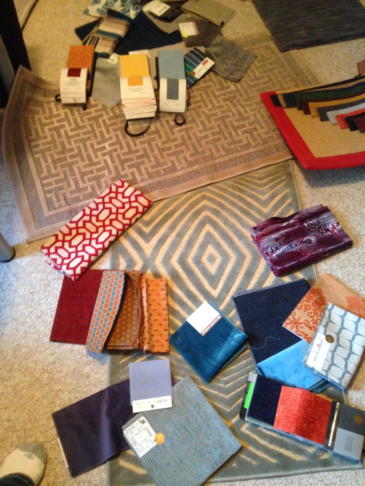


and was narrowed down to this final selection of 50 shades of blue, 
golds, and a bold hit of pumpkin orange in a floral medallion pattern. 
A geometric art silk rug sits in the background.


Once all the main piece were selected and fabrics for pillows and drapery chosen, we moved on to the accessories and I found some fun pieces that my client loved


Here's a closer look at the custom drapery in a luxe silvery chenille fabric with 6" fabric banding 
to match the pillows on the chair... so yummy!  
Client already had the custom roman blinds in a graphic silver & gold pattern, 
so I worked with them when choosing drapery fabric.


The final reveal comes in two parts
Part one - without drapery 
(note to self: don't order them so close to the holidays!)


It's amazing what a bit of paint and some new hardware can do for your dated furniture!


Part two - some new pillows added but without the rug 
- it was accidentally soiled by the family dog the night before I arrived for the photo!


Love ending the post with these gorgeous chairs!

My client has been entertaining a lot more since this room was completed.
Just goes to show that living rooms can be transformed for contemporary, real-life living!


Decorating with Blue


I must say that I haven't used a lot of blue in my own decor except for the Tiffany blue accents in my office.  

So when my client asked me to zhush-up her already lovely living room, my first instinct was to ramp up the intensity of the blues she loves to add some drama to the space while still keeping it very sophisticated.


As you can see from the Before shot above, the floors are a beautiful dark hardwood, the trim work and paint colour is classic, and the shapely ceiling is a great feature - but the room is relatively "boring" according to my client and really wasn't comfortable for entertaining.  

So the challenge was to create an inviting space that would accommodate several people at once for drinks before and after dinner but also to function as the spot for their upright piano (off to the right side of the above photo) and as a quiet, weekend reading spot.

One of the other key issues that makes this room "not quite right" is the scale and proportion of the furniture.

All the furniture, except the sofa, was purchased for a previous, smaller home.  The accent Persian rug (below) is a sentimental piece for the client, so we are keeping it and using the colours as a jumping off point for the room.  We'll place a much larger, wool sisal rug underneath to help visually expand the space, keeping the Persian as a focal point on top.


The coffee table is also too small and will be replaced with a larger one.  
The settee is going to another room, and we'll bring in two larger chairs and some side tables to accommodate the long, narrow room.

This was one of the inspiration images that really spoke to my clients in terms of the feel for the room.

Blues and Browns ~ Quatrain wall brackets

They wanted to keep a mix of contemporary and vintage pieces; some sparkle with their existing crystal sconces and aged finishes like antique brass and weathered silver; luxurious fabrics, and artwork that creates interest but is complimentary to the colour palette in the rest of the room.

So once the floor plan was done, I started to pull fabrics for the upholstery and pillows.
Here's the fabric scheme we landed on


The damask and leaf patterns are from Joanne Fabrics as are some of the blue/green velvets.

We are adding two of these modern wing chairs that will back onto the dining room

with the sage green velvet on the front and the damask on the back - can't wait to see it!
(a similar pattern is on the dining room end chairs in a gold fabric) 


The clients existing tufted arm chairs will get a big beauty boost
upholstered in this gorgeous cerulean blue velvet - YUM!


I also found this great fabric that will be used for a couple of pillows.  The client has an affinity for French decor and loved it as soon as she saw it.


The other big change in the room will be larger scale art pieces.

We'll add something colourful above the sofa working within the colour palette 
but adding some depth and interest to the well-lit space.

Here's a few pieces we're considering:


I think I see an image of a person in this one - do you?

 Decorating with art really takes a space to another level (as I've noted in another post here).

Given the main purpose of the room is to entertain, a place to store and mix drinks was key.  I looked at open bar carts, but this room really needed a larger piece to sit next to the sofa instead of an end table.

We're going to use this antiqued mirrored cabinet and then glam it up with styling... 


gold gold everywhere on the bar


glamorous bar carts - cocktail trays1.jpg


Mad Men drinks tray

Oh, the beauty of filled crystal decanters at the office!


And on that note, I'm suddenly feeling thirsty.


You Might Also Like